Vinnie Mehta

My Role

Lead UX Designer & Strategist

Tools

Figma, Photoshop

Undraw.co, Crazy egg

Google Analytics

Deliverable

End to end UX design strategy and visual design.

Click to view Figma prototype

Download brief case study

Problem Statement

Users are taking the listed contractor’s information and reaching out directly, hence passing the platform and resulting in revenue loss.

HMW Statement

How might we help the user to rebuild trust to request quotes to meet their needs?
How might we help the user to find a reliable service contractor without feeling frustrated?

Business Goal

  • Rebuild customer’s trust to request quotes.
  • Increase visibility for premium service contractors.

User Goal

To find a trustworthy service contractor within budget.

Research

Website Redesign

Research Objective

To identify the users' pain point.

How the user interacts with the existing website? What are their navigation struggles?

To understand and why user use the site as a directory.

What are users' needs, and how to grow users' trust to request quotes from service contractors?

To analyze first impressions of the site.

How does the user interact and feel about the content and visual design of the existing site?

Quantitative Research​

I examined the website’s heat and scroll maps from crazy egg along with google analytics data from past twelve months.

Crazy Egg Analytics

I examined home page analytics and found that :

  1. The how it works section of the website doesn’t get noticed by the users. It has the lowest engagement.
  2. Step 1 out of 5 of the request quote form getting attention, but still, AllQuotes is not getting user signups to request quotes.

Home page

Google Analytics

I examined home page analytics and found that :

  1. The how it works section of the website doesn’t get noticed by the users. It has the lowest engagement.
  2. Step 1 out of 5 of the request quote form getting attention, but still, AllQuotes is not getting user signups to request quotes.

I analyzed landing page-views and behaviour flow of the hero CTA request for quotes. Out of 100k page views:

  1. Users are dropping off on the first interaction with the request quote form. Only 3% of users are getting engaged based on behaviour flow.
  2. The customer login page is getting 2.19% page views.
  3. The business listed page is gaining 2.19% page views.

Based on Analytics

Quantitative Research​ Findings

New visitors aren't signing up.

The users are dropping off right after the first interaction with the request quote form based on google and crazy egg analytics.

Existing customer retention is very low.

The customer login page gets only 2% views out of 100k landing page views based on the user behaviour flow of google analytics.

Low content engagement

How it works section has low visibility. It is placed very low on the home page based on analytics page views.

Primary Research

I conducted four 30-minute interviews with :

  1. Stakeholder/ Founder of AllQuotes.
  2. Four user Interviews along with usability test with existing AllQuotes’s website.
  3. Unmoderated test to get the first impression of the existing site.

Founders Interview

I conducted two rounds of the stakeholder interviews with the founder/developer of AllQuotes to understand stakeholder’s following problem assumptions:

  1. The users are using the AllQuotes website as the contractors’ directory rather than requesting quotes.
  2. Only 3% of users request quotes despite driving high traffic towards the site through social ad campaigns.
  3. Revenue through the business listing is becoming difficult.

User Interviews & Usability Test

I recruited four users from my network group to conduct moderated user interviews. I also ran an unmoderated user interview from a design critic peer group to get the first impression feedback about the existing website.

Interview Objectives

  1. Users interaction touchpoints before requesting a quote from a service contractor.
  2. User journey map for requesting a free service quote.
  3. Clearly define the user’s pains, motivation and assumptions for performing tasks.
User_inter

User's Comments

During interviews user quoted the following comments:

  1. I want to check the five-star rating and reviews of the business, but it asks me to sign up when I click “read more”.
  2. don’t understand how it works. I am looking for the phone number.
  3. I don’t want to sign up because it will take my time, and I will get bombarded with many follow-up emails.

Between Quantitative & Primary

Research Findings Correlation

Analytics: “How it works section” has the lowest engagement.

Interview: User fears getting too many emails for requesting quotes.

Analytics: Only 3% of users requested the quotes.

Interview: The user lost trust because the quote form required the user to sign up to fill-up the form.

Analytics: Only 2.19% of the users visited the business Listing page, and 1.84% clicked on categories.

Interview: The user gets frustrated because of severe design inconsistencies, broken flows, or irregular interaction patterns.

Based on Quantitative & Primary

Research Findings

Broken user flows & design inconsistencies

There are severe design inconsistencies, broken flows, or irregular interaction patterns. For example, request quote CTA linked with filtering system only, not user's input requirement.

User need trusted contractors

Users need to find and hire a trusted service for jobs to be done efficiently within their proximity and budget.

The user is looking for a few quality quotes.

User isn't looking to get quotes from many contractors instead; they prefer quotes from contractors with good customers reviews, rating and project photos.

Research Findings from

Competitors Research

Heuristic Analysis

I did the heuristic analysis to learn about search filters customers review features and visual design interface and got the following insights:

HiPage_logo
BuildZoom
Fixr
  1. Accessible & intuitive quote form.
  2. Location filters for a searching contractor based on proximity along with the map.
  3. Reviews and client project photos.

Usability Evaluation

HiPage_logo
BuildZoom

I conducted two usability evaluation of the competitors’ website and gained the following insights:

  1. User preferred hiring contractors within proximity.
  2. User trusted customers’ review feature with project photos.
  3. Users were engaged and willing to communicate further through live chat.
compitor

Design

Website Redesign

Design Goals

To Improve user's task flows

The website has broken task flows. For example, the user is dropping off right after the first interaction.

To enhance content hierarchy

The user experienced a cognitive load during the usability evaluation. In addition, the website lacks a visual hierarchy and has poorly aligned content.

Accessible visual design

There are severe design inconsistencies and irregular interaction patterns.

Defining Goals

User Task Flow

Based on research findings I sketched user’s task flows for requesting quote and searching contractor’s in the proximity.

  • Get quote CTA
  • Find contractor near you CTA

Defining Goals

Red Route

The study reveals that the customer journey involves multiple touchpoints to make an informed procuring decision. I designed the red route matrix based on the following key insights from research findings:

  • Build trust through customers projects reviews and photos.
  • Quick and easy process to get quotes.
  • Clear and precise how it works section.
red_route

Wireframe

Solution Assumptions

I designed solutions assumptions to keep the business goal in mind to rebuild user trust-based users’ needs according to research findings.

Quote Form

I turned user task flow from 5 steps process to 3 step process. As a result, the first three fields will automatically get filled through CTA to get your quote. The main objective here is that the user should not feel overwhelmed by filling out irrelevant information.

Taskflow1
taskflow2

Hero Section Design

I have designed two CTAs.

  1. Get a free quote for novice and budget-conscious users.
  2. Find a contractor for advanced users who like to get quotes from selected contractors based on their specific needs.
  3. Keeping stakeholder’s need to have a feature that provides more visibility to premium contractors to increase revenue.
  4. Added the most popular clickable services keywords for quick selection at the bottom of CTA.
  5. An additional smaller search bar will get activated and remain active globally after passing the hero section.
heroSection

How It Work Section

  1. Placed “How it works section” right after the hero section for better visibility based on quantitative research finding to the lowest user engagement for this section. 
  2. Replaced the video message with a clear and precise message to address users fear of getting too many emails after requesting quotes.
how Itworks

Service Categories

AllQuotes broad spectrum of unclassified categories, such as plumbing to graphic design, was confusing users.

  1. I added qualified contractors credentials to the category section. I classified the categories into a group with horizontal scrolling to lower the cognitive load for the user to increase user engagement.
  2. For stakeholder’s need, categories grouping will help generate more revenue by offering higher visibility to the premium business listings.
popular_servcie

Business Listings​ Page

I have included the following content to improve the user experience based on research findings:

  1. Customers’ review feature with project photos
  2. Contractors’ credentials.
  3. Geolocation filter to sorting listed businesses.

wirerframe

Low Fidelity

After synthesizing and defining research data, I designed low fidelity wireframes to discuss my solution assumptions with stakeholders.

Design System

I worked with the existing brand colours but reassigned the colours to global UI to introduced white space and improved the visual experience. In addition, I included original customer’s project images based on user interview findings and added engaging and trending illustrations.

design sytem

Homepage With Revised Color Allocation

Before

After

wirerframe

Hi Fidelity

Based on the client’s feedback, I reiterated and designed high fidelity wireframe. According to the stakeholder, It required few more data inputs from users. She mentioned concerns regarding the single page quote form.

Usability Test

I conducted two user usability test and one with stakeholder to test my solution assumptions. Reiterated the prototype to test the following with external users:

  1. Test user task flows CTAs
  2. Testing readability, accessibility & affordance.
  3. Overall impression of the site.
userTesting

Next step​

Design Handover

I handed over the project to the client by giving all the organized documents. I have designed with research and usability test finding. Also conducted zoom meeting with the client to discuss the execution of the new design and proposal for the next phase goals as follows:

  1. I suggested doing a usability test one more time with a larger user pool.
  2. Also recommended to do the development of a redesign in sections and testing it simultaneously.
  3. For the next phase, we should focus on improving the customer’s dashboard & communication system.
handoff

Other Projects

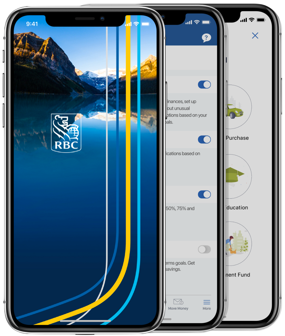
BANKING APP FEATURE DESIGN

RBC mobile banking app launched an AI service called Nomi, helping users save on an average $225 a month through its existing NOMI Budget and NOMI Find & save.

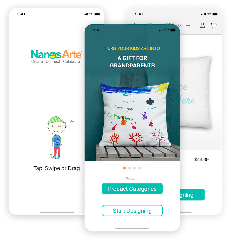
E-COMMERCE MOBILE APP

Nanos Arte is an e-commerce store and turns kids' artwork into a personalized gift for family and friends to celebrate special days. An iOS mobile app helps the user design mockups before placing an order of their personalized gift.